Go Back To Blog Listing?
Is your business leveraging the power of creative infographics? Here’s why it must
Without infographics, information would still be a monster that munches on time for a hobby. Progress is all about finding new, effective, and efficient ways to consume, use and share information. Humans have always worked towards making life easier. And it’s our innate drive to make things simpler.
The irony is, we often work harder than usual to make things easier in the long run. Design thinking is exactly that. Any creator or problem-solver would look at all the aspects of a problem statement, challenge assumptions, find solutions and then find a way to communicate it. On the same road, we discovered information design.
What are infographics?
Information design fundamentally changed the way we consume, share and perceive information. Imagine a few years ago we were reading small manuals with tiny written words. To be honest, how many of us ever read it? The same information uses icons, graphics, process timeline, and whatnot when presented. Suddenly, it is easier to understand manuals.
Infographic is an offshoot of information design. Businesses have been finding new ways to communicate better with their stakeholders. Business infographics have reduced the hours spent on reading data-heavy reports.
It allows us to tell a story through pictures. And it's a global thing now. It helps us convert a lengthy article into a visually appealing graphic that doesn’t spare any details and hooks a reader effectively.
Why businesses are using infographics?
Infographics made communication for business stakeholders fun, engaging and informative task that doesn’t waste their time. Businesses use infographics to compile heavy information and present them through visual art with minimal text.
Apart from communication, infographics are great for online marketing and business development. SEO professionals spend a good chunk of their time finding ways to create links for their websites. Infographics are great for natural link building. The recent updates to the Google algorithm support this. A reader is more likely to share an infographic than a 1000 words article with their friends.
Businesses can leverage the power of creative infographics for their high shareability. It engages readers, draw their attention, and makes them want to share a piece of complicated information that never seemed this easy.
What business goals you can achieve using Infographics?
It is great for both B2C and B2B marketing, and internal communication. You can synthesize long reports into one slide, visualize statistics, create a visual journey for users or assets, visualize an algorithm or create process maps.
Creative Infographics help a business accomplish several critical business goals. These goals can range from online marketing to synthesizing large surveys.
Some of the goals it might help you achieve are:
- Inform your stakeholders without taking up a lot of their time
- Convey trends and learning from a large dataset
- Make communication easier, comparing data, et cetera.
Think about why you are designing the infographic. What do you want to convey? How can the information be broken down? Which information can be packed in a design element?
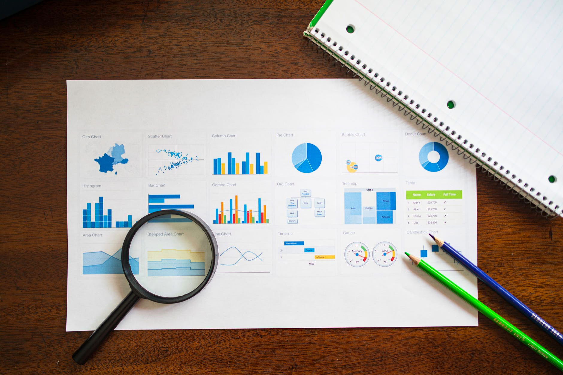
Just imagine how long it would be if we created different customer personas without infographics. Instead of writing pages of their patterns and behaviours, you can create fictitious personas with just a few charts and tables.
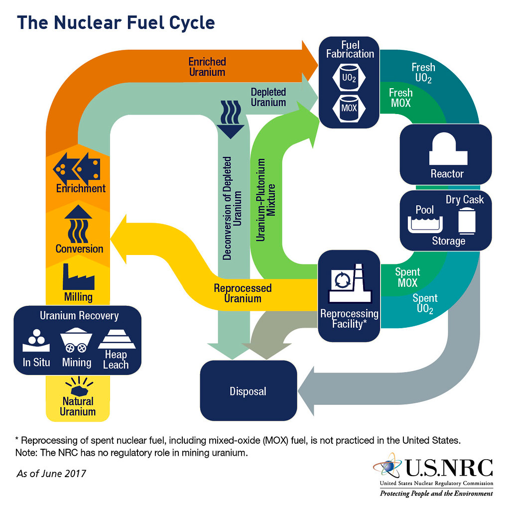
Take a look at the infographic below. It tells the journey of nuclear fuel. Now imagine if this information needed conveying through words and without any visual cues.
What are different types of infographics and when to use them?
Here are some of the infographic’s elements. You can use more than one at a time to tell a compelling visual story. They can be used both for external and internal use. They make it easy to communicate with customers and stakeholders or to present a complex idea clearly in a team meeting.
- Flowchart:
Can’t be used for presenting data. Best used when the goal is to drive a stakeholder to a conclusion or a solution. A flowchart is a decision-making tool. You can visualise the working of a complex algorithm or convey the inner working of a team. Perhaps, display how your product or service will result in different experiences based on pairing.
For example, a new coffee brand can create a flowchart infographic about how choosing different types of coffee and brewing methods would result in different types of experiences.
- Comparison:
Used for spreading awareness. It engages readers and gives them a clear distinction between two or more things. Contrary to bombarding them with hundreds of words. A great example would be a “pros and cons” infographics, where you can display facts side by side using visual cues.
You can compare people, products, places, eras, countries, political ideologies and even show before-after comparison. Possibilities are endless. Do your research before starting this. Have a few bullet points, data points, and other information that you want to convey to your customers or your team members.
- Timeline:
Shows information with time as a context. You can show changes with time in History or show projections for the future. You can use it when you want to inform stakeholders about a change over time. Use it within the team to have a clear picture of a process or a project timeline. Define the milestones before starting this.
- How to:
Used to convey complex instructions. You can use graphics to visualize all the instructions and remove vocabulary or language as a constraint. It can be used to educate and create awareness. For example, you can have a “how-to” for navigating your website or using your product.
- Data story:
Used to tell a story through data. Of course, somebody would need to analyse data and look for patterns, trends, and conclusions before thinking of creating infographics. Once you have all the information and insights from the data that you want to tell your customers or stakeholders you can choose which graphic element will best visualise your findings or projections.
For example, Pie charts can be used to show percentage distribution, bar charts can be used to compare data and find growth or shrinkage
Conclusion
There are no bounds to what you can include in an infographic. Imagination is the only limit. But if your business is not leveraging the subtle power of disseminating information through infographics, then there is a high chance that you might regret it.
So, to save you from all those negative feelings, we're here to make things a lot easier for you. Our team of specialists takes an awful lot of pride in the stories they create through meaningful graphics. Your brand deserves that too. Shooting us an email at [email protected] and [email protected]